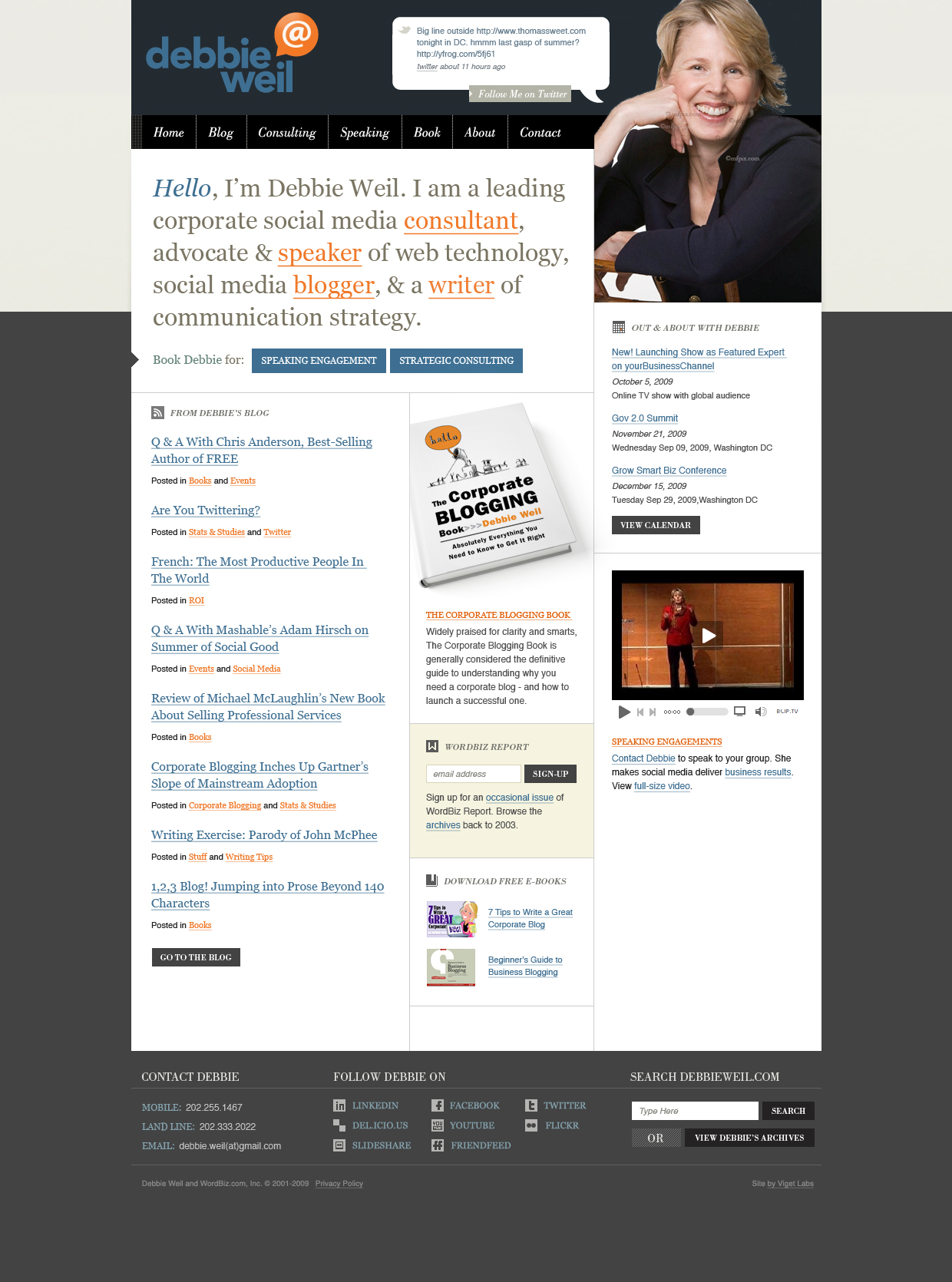
If you’re not interested in Web site design, stop reading right here. If you are… take a peek at my redesign by the clever folks at Viget, featuring an “illustration” of yours truly as well as my new logo with the @ sign, designed by the talented Erick Anderson. Erick won the logo contest I ran on Genius Rocket. More on that later.
I’ve gotten positive and negative feedback on the illustration. Mostly negative. So we’ve decided to put a headshot there instead. (Below is a very rough mock up. We’re still fooling with the background colors.) The illustration is an interesting idea. But doesn’t feel quite right. One colleague called it “off brand.” A Facebook friend called it “playtime.” Another longtime colleague said simply, “Away with the avatar; we want to see Debbie.” And one of my grown children said, “OMG who is that scary lady. Get rid of her.”

We’ll also be adjusting the background colors to make my new logo “pop.” The goal of the redesign is to make clearer what I do (i.e. consult and speak) and to de-emphasize my blog.
I’m not a blogger. I’m someone who blogs. According to Technorati’s just released State of the Blogosphere 2009, that puts me in good company. “Professional part-timers,” as Technorati calls them, are one of the biggest segments of the blogosphere. And of those, 72 percent blog to attract new clients.
So while blogging is an integral part of my public face on the Web, it’s no longer the only way I lay down a digital footprint. I Twitter more than I blog, I post regularly to Facebook and I’ve recently become a much bigger fan of LinkedIn (which has a new set of interactive features).
Stay tuned. The new site won’t be up for several more weeks.
Useful Links
Technorati’s State of the Blogosphere 2009
Technorati CEO Richard Jalichandra’s slidedeck on the 2009 findings
